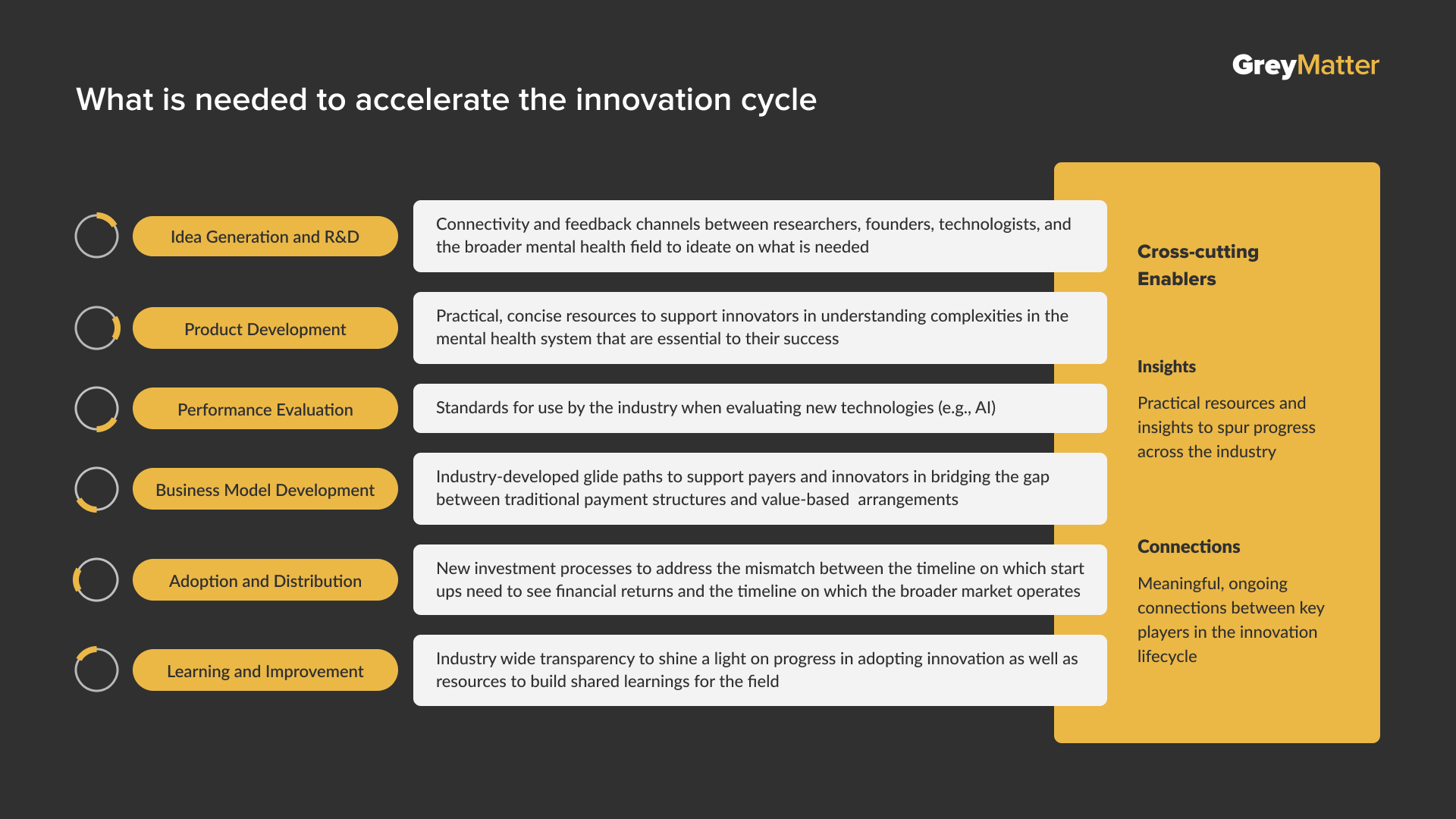
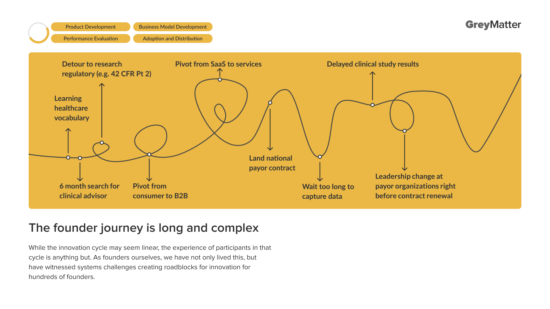
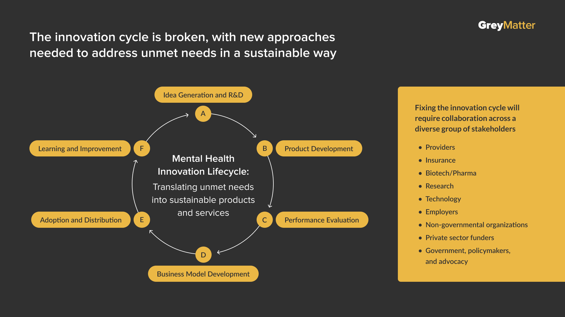
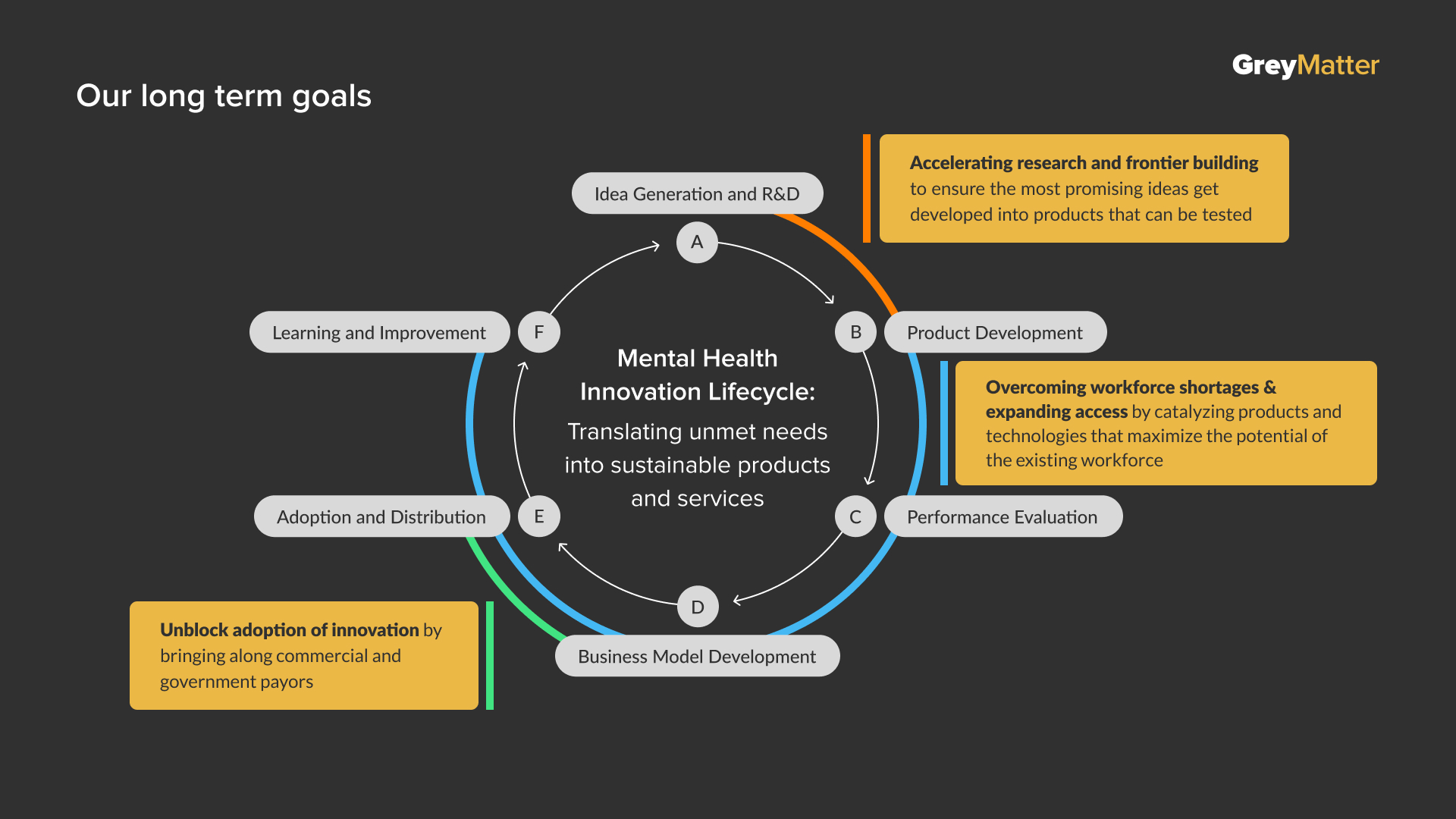
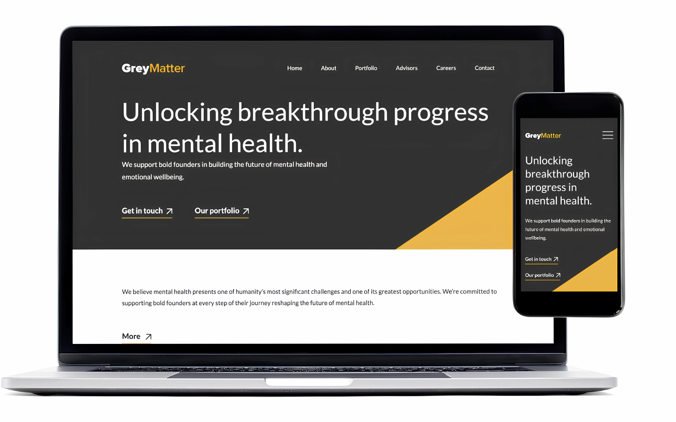
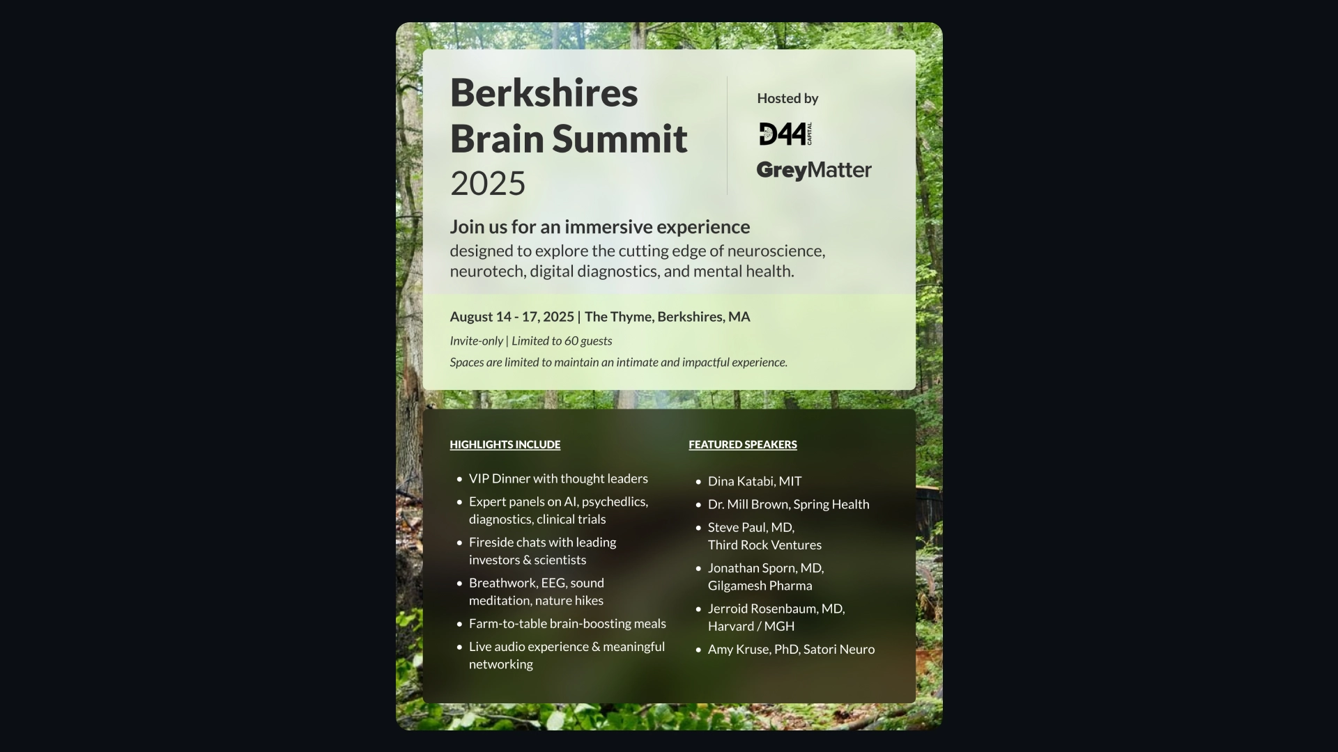
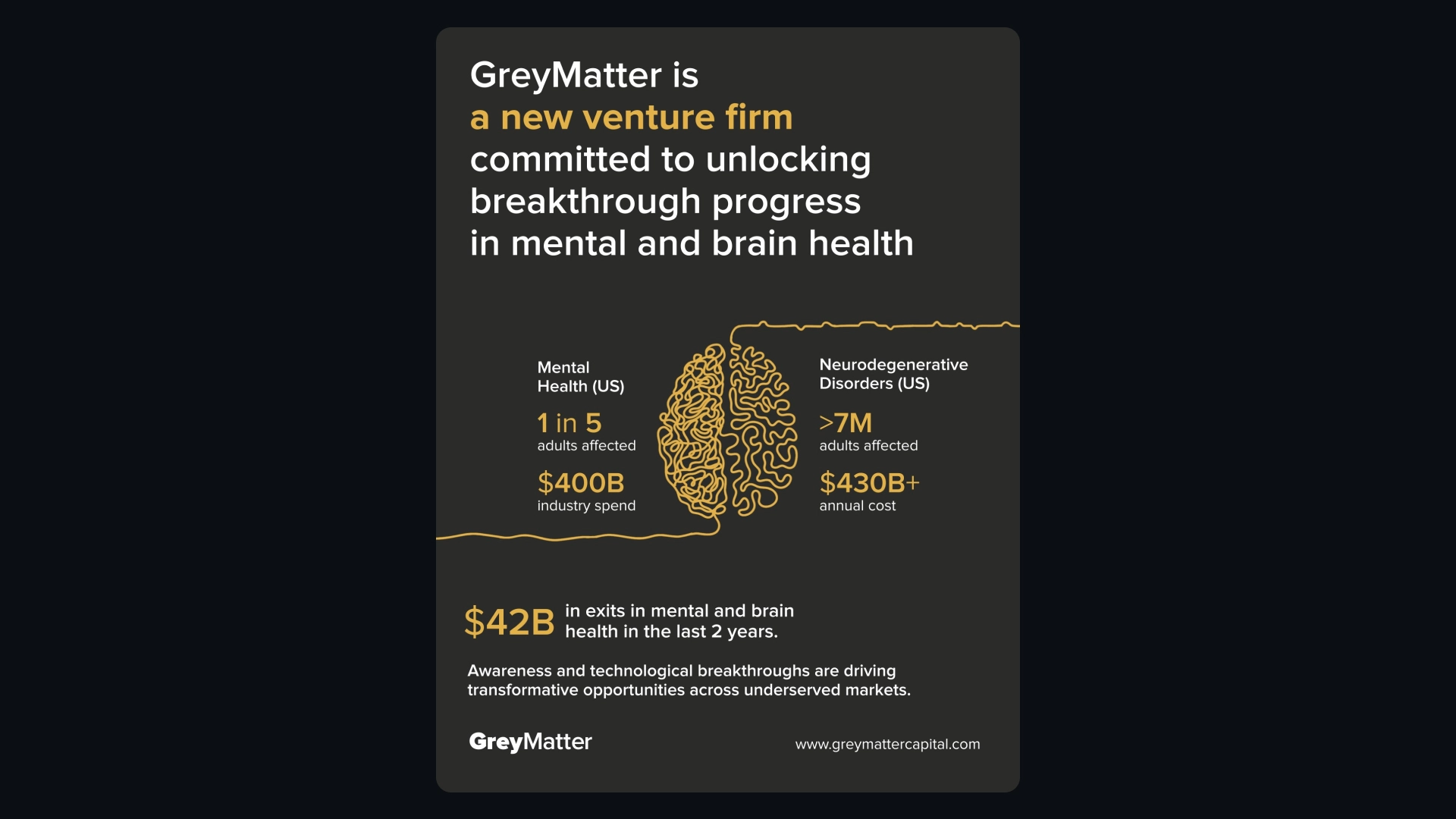
The final identity was built around a focused set of elements that could be recombined across different formats.
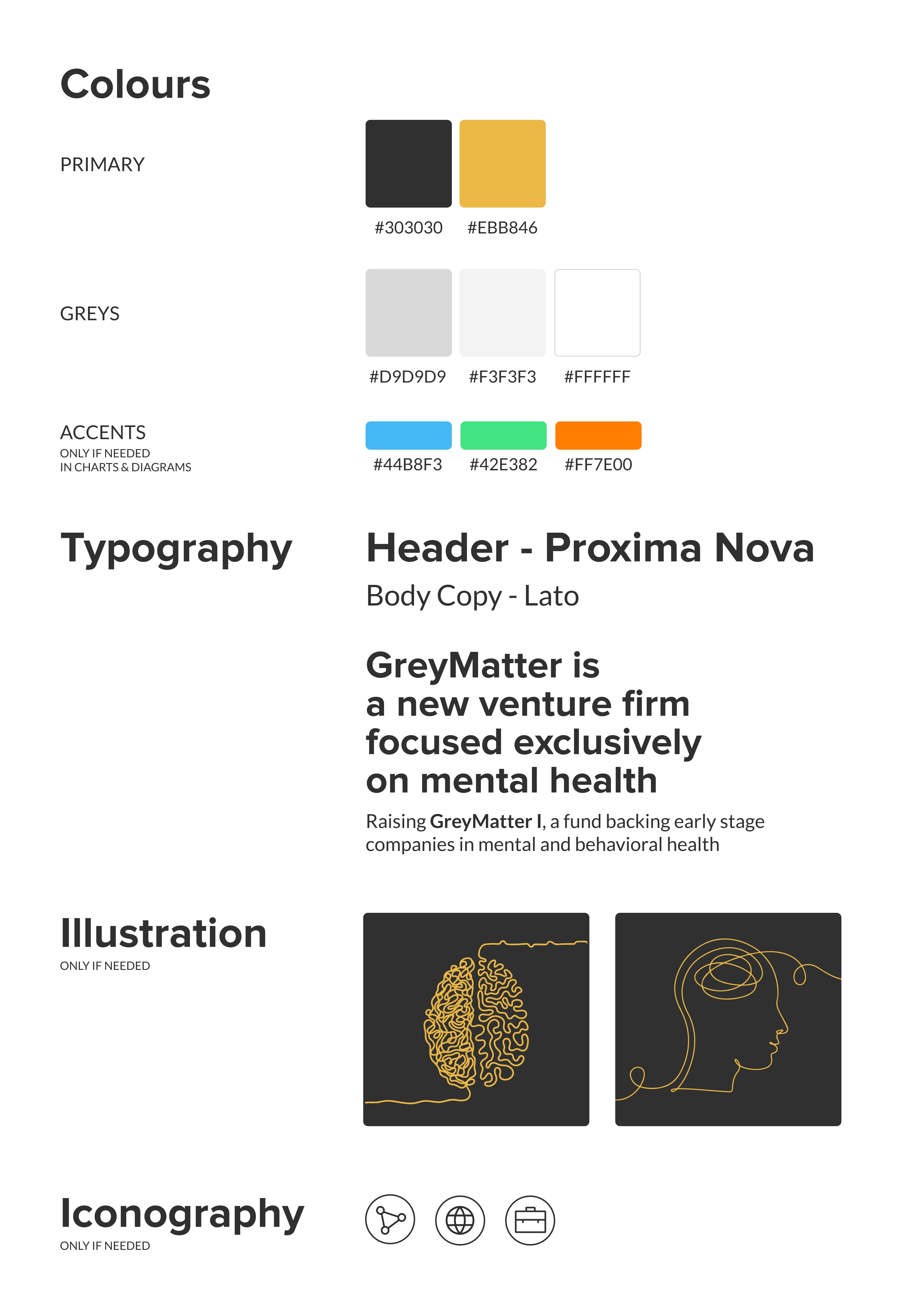
Colour
Charcoal · Grey · White · Yellow
A neutral foundation paired with a distinctive yellow accent.
Typography
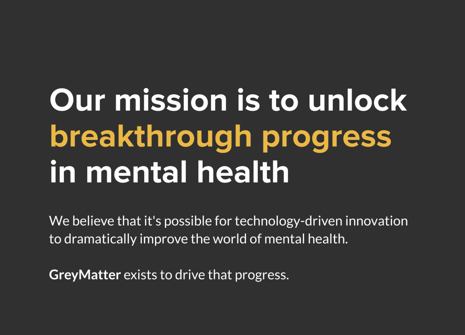
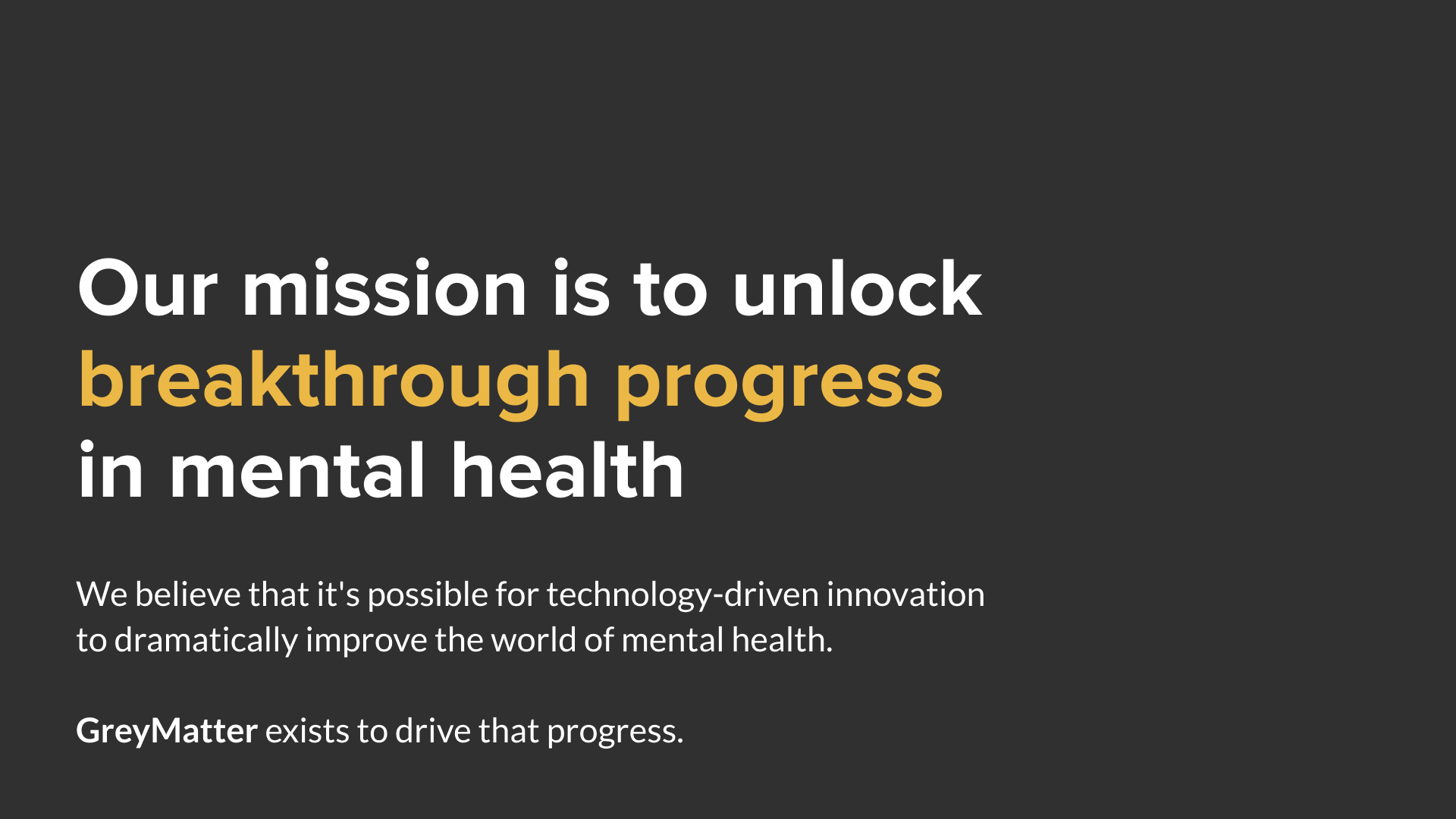
Large editorial-style headlines + highly readable body copy
Large statements created impact while a clear hierarchy supported information-heavy content.
Graphic Elements
A small set of recurring graphic devices that could be used when they added structure or clarity:
- Thin-line pathways
- Rounded cards
- Yellow highlight bars
- Minimal iconography
- Diagrams
- Data blocks
The system deliberately avoided unnecessary visual elements. If something didn't improve understanding or communication, it didn't need to be there.
Image + Illustration
Photography and custom illustration were introduced when a communication needed a more expressive or contextual treatment.
Iconography and illustration were intentionally kept to a minimum. I only introduced them when they served a clear communication purpose - primarily to improve clarity or help explain a concept.
The identity was designed to be confident without relying on decorative elements. This restraint helped keep the visual language clean, focused, and flexible across different applications.